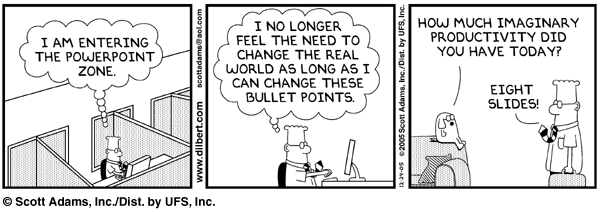
HAPPY NEW YEAR, and Welcome to 2006! I thought of no better way to start the year than to start with a rant! I hope your new year is filled with less PowerPoint, why? You may ask?...if you sat through as many senseless, boaring, and death by PowerPoint sessions you wil understand.
Imagine a widely used and expensive prescription drug that promised to make us beautiful but didn't. Instead the drug had frequent, serious side effects: It induced stupidity, turned everyone into bores, wasted time, and degraded the quality and credibility of communication. These side effects would rightly lead to a worldwide product recall.
Yet slideware -computer programs for presentations -is everywhere: in corporate Western World, in government bureaucracies, even in our schools. Several hundred million copies of Microsoft PowerPoint are churning out trillions of slides each year. Slideware may help speakers outline their talks, but convenience for the speaker can be punishing to both content and audience. The standard PowerPoint presentation elevates format over content, betraying an attitude of commercialism that turns everything into a sales pitch.
Of course, data-driven meetings are nothing new. Years before today's slideware, presentations at companies such as IBM and in the military used bullet lists shown by overhead projectors. But the format has become ubiquitous under PowerPoint, which was created in 1984 and later acquired by Microsoft. PowerPoint's pushy style seeks to set up a speaker's dominance over the audience. The speaker, after all, is making power points with bullets to followers. Could any metaphor be worse? Voicemail menu systems? Billboards? Television? Stalin?
articularly disturbing is the adoption of the PowerPoint cognitive style in our schools. Rather than learning to write a report using sentences, children are being taught how to formulate client pitches and infomercials. Primary school PowerPoint exercises (as seen in teacher guides and in student work posted on the Internet) typically consist of 10 to 20 words and a piece of clip art on each slide in a presentation of three to six slides -a total of perhaps 80 words (15 seconds of silent reading) for a week of work. Students would be better off if the schools simply closed down on those days and everyone went to the Exploratorium or wrote an illustrated essay explaining something.
In a business setting, a PowerPoint slide typically shows 40 words, which is about eight seconds' worth of silent reading material. With so little information per slide, many, many slides are needed. Audiences consequently endure a relentless sequentiality, one damn slide after another. When information is stacked in time, it is difficult to understand context and evaluate relationships. Visual reasoning usually works more effectively when relevant information is shown side by side. Often, the more intense the detail, the greater the clarity and understanding. This is especially so for statistical data, where the fundamental analytical act is to make comparisons.
Consider an important and intriguing table of survival rates for those with cancer relative to those without cancer for the same time period. Some 196 numbers and 57 words describe survival rates and their standard errors for 24 cancers.
Applying the PowerPoint templates to this nice, straightforward table yields an analytical disaster. The data explodes into six separate chaotic slides, consuming 2.9 times the area of the table. Everything is wrong with these smarmy, incoherent graphs: the encoded legends, the meaningless color, the logo-type branding. They are uncomparative, indifferent to content and evidence, and so data-starved as to be almost pointless. Chartjunk is a clear sign of statistical stupidity. Poking a finger into the eye of thought, these data graphics would turn into a nasty travesty if used for a serious purpose, such as helping cancer patients assess their survival chances. To sell a product that messes up data with such systematic intensity, Microsoft abandons any pretense of statistical integrity and reasoning.
Presentations largely stand or fall on the quality, relevance, and integrity of the content. If your numbers are boring, then you've got the wrong numbers. If your words or images are not on point, making them dance in color won't make them relevant. Audience boredom is usually a content failure, not a decoration failure.
At a minimum, a presentation format should do no harm. Yet the PowerPoint style routinely disrupts, dominates, and trivializes content. Thus PowerPoint presentations too often resemble a school play -very loud, very slow, and very simple.
The practical conclusions are clear. PowerPoint is a competent slide manager and projector. But rather than supplementing a presentation, it has become a substitute for it. Such misuse ignores the most important rule of speaking: Respect your audience.
No comments:
Post a Comment